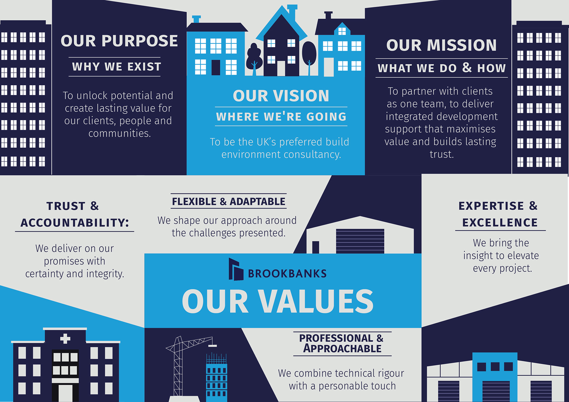
Creative support for Brooksbanks, developing clear, engaging training materials, informative infographics, and cohesive digital assets across social and internal communicatio

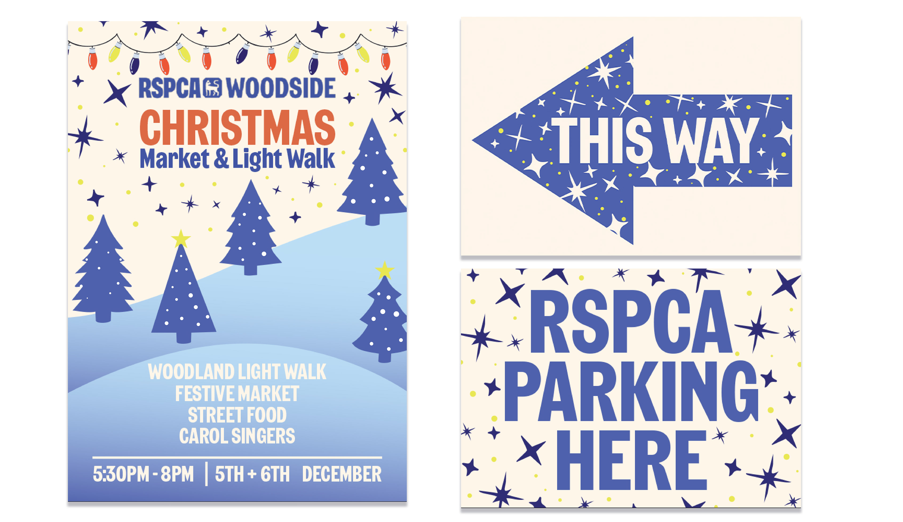
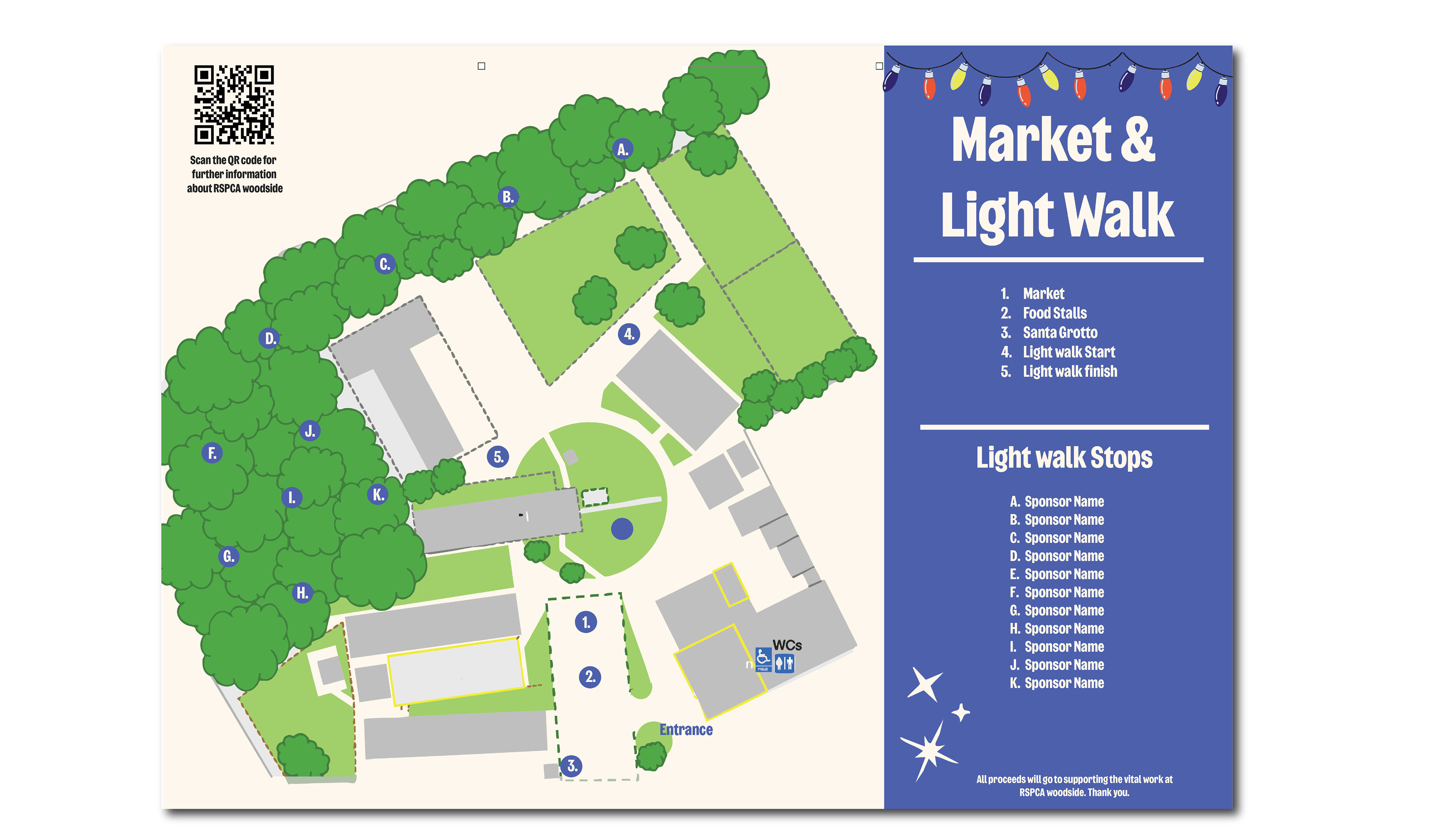
The RSPCA approached me to develop engaging visual assets for a campaign/event aimed at raising awareness and encouraging participation. The brief required a brand aligned, approachable design system that could work across both print and digital channels while appealing to a broad audience. The focus was on creating clear, friendly, and consistent visuals that reflected the RSPCA’s values of compassion, trust, and advocacy for animal welfare. The design system needed to be flexible enough for multiple applications and future campaigns.



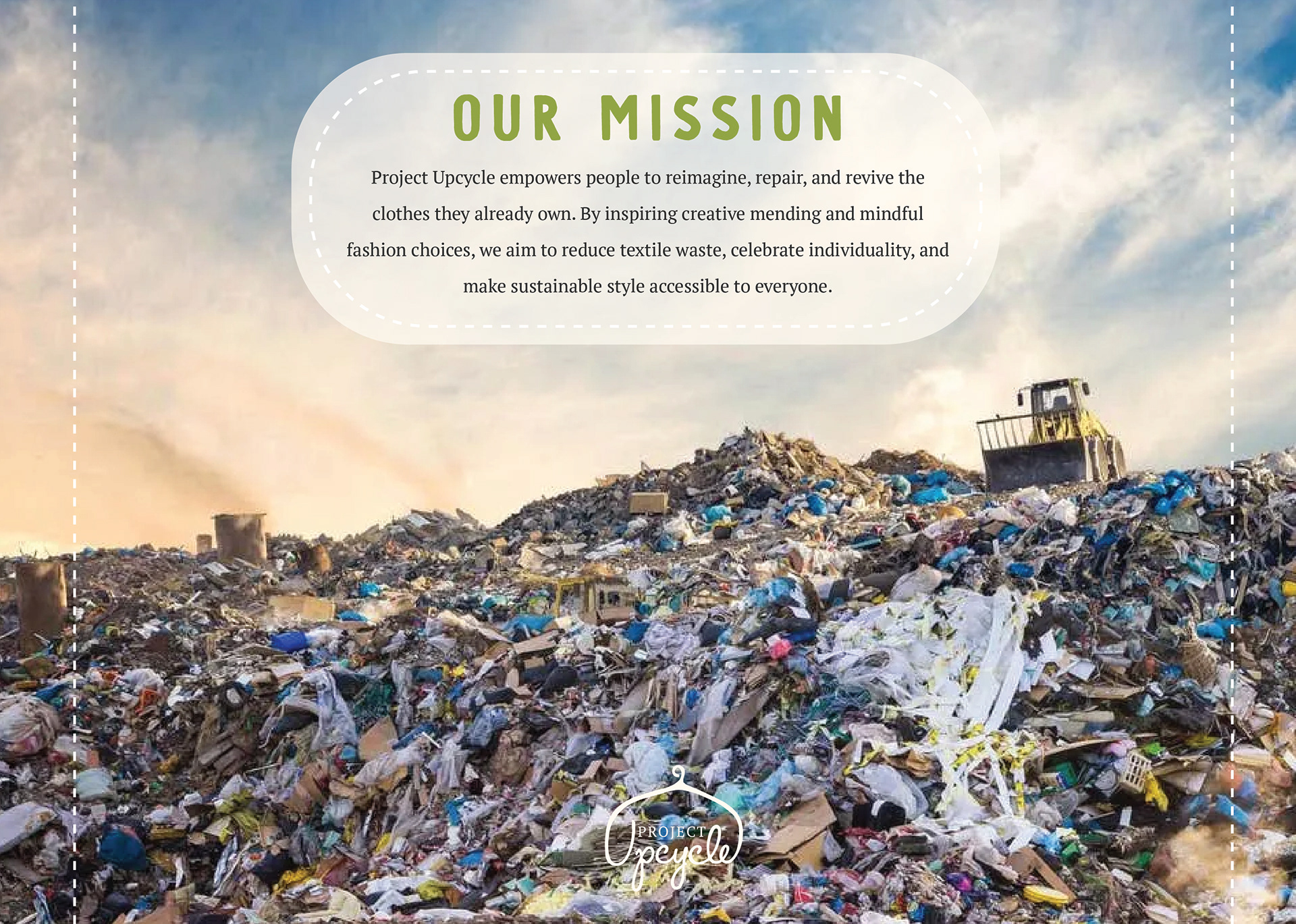
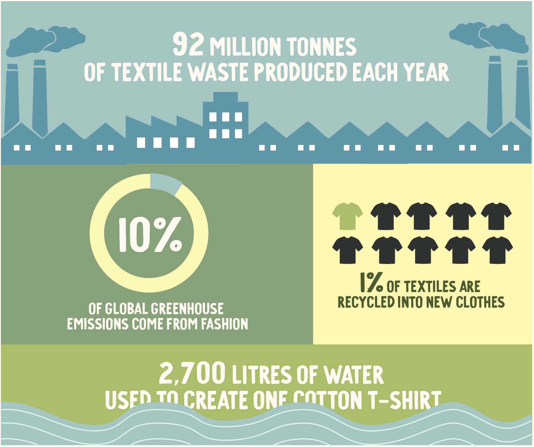
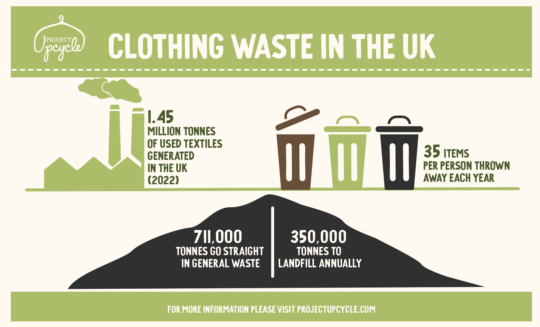
Project Upcycle is an initiative designed to encourage shoppers to repair, alter, and extend the life of their existing clothing rather than buying new items. The aim was to create a campaign that felt accessible, inspiring, and environmentally conscious, empowering people to make small changes with a big positive impact.
Educational posters and guides explaining how to upcycle and repair clothes. Social media graphics promoting sustainability tips and upcycling ideas. Workshop materials and branded resources for in-store or community event
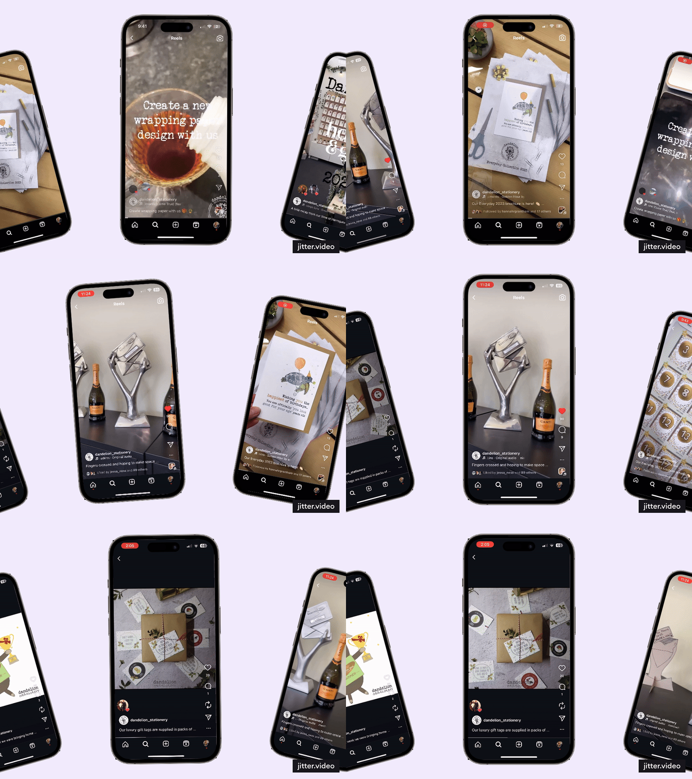
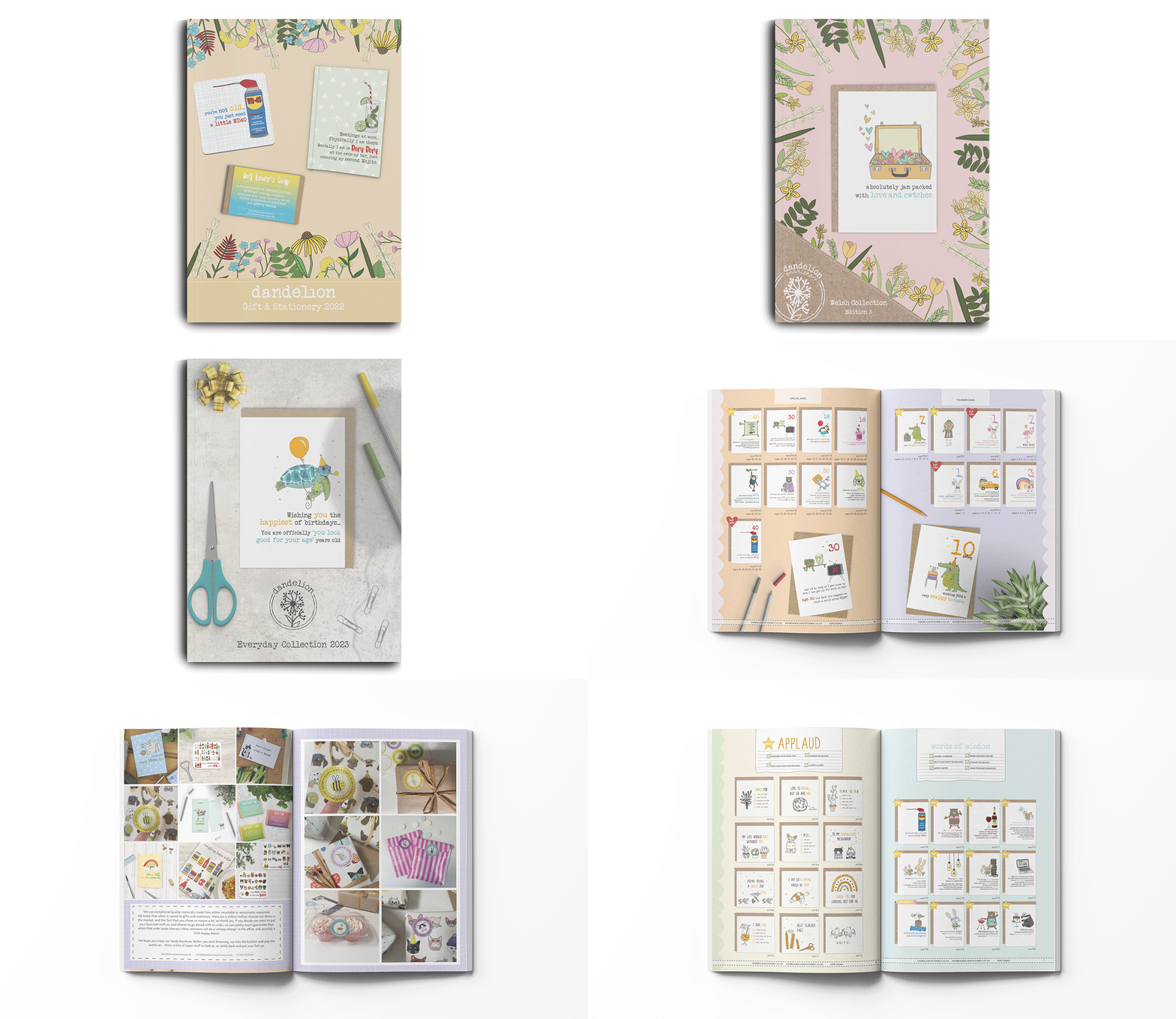
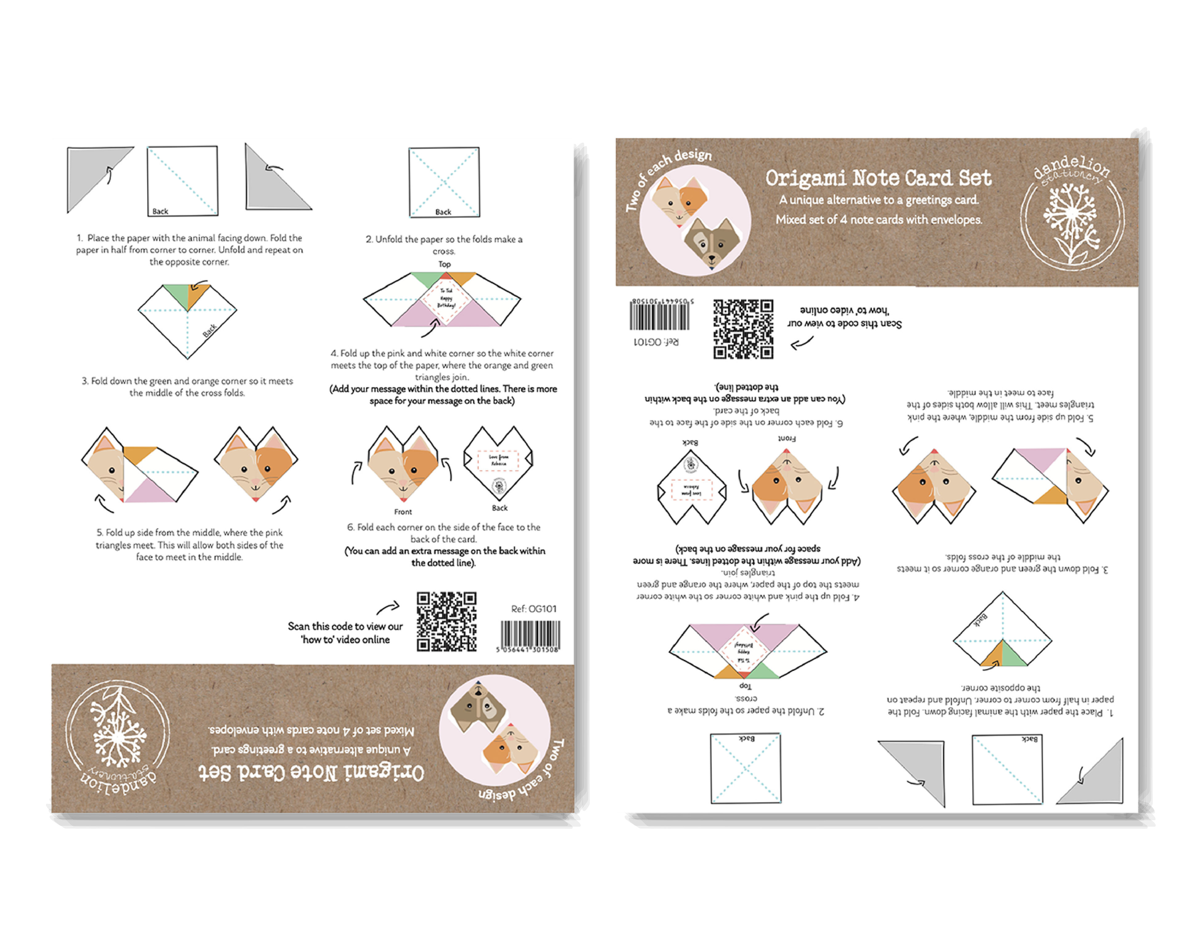
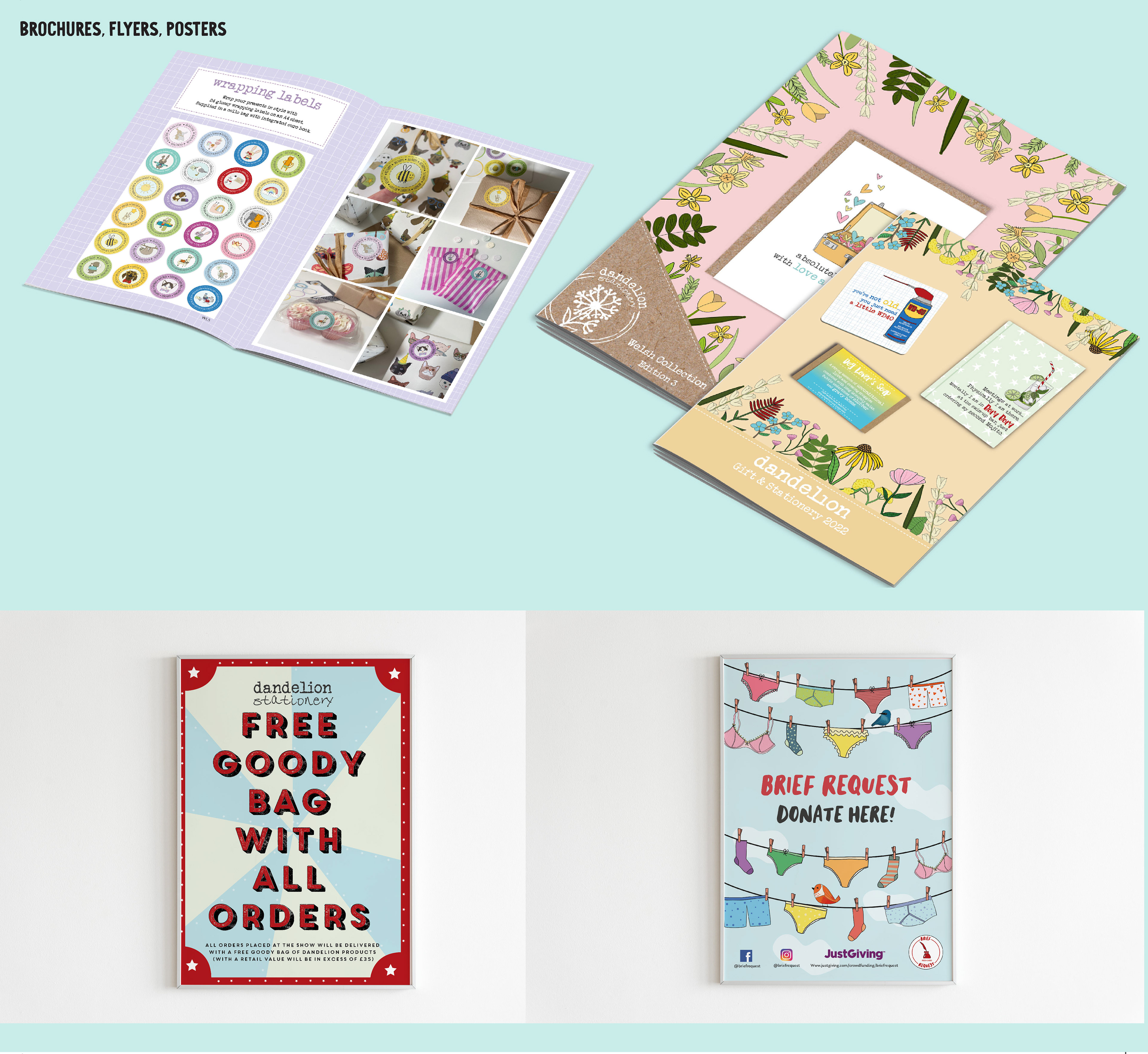
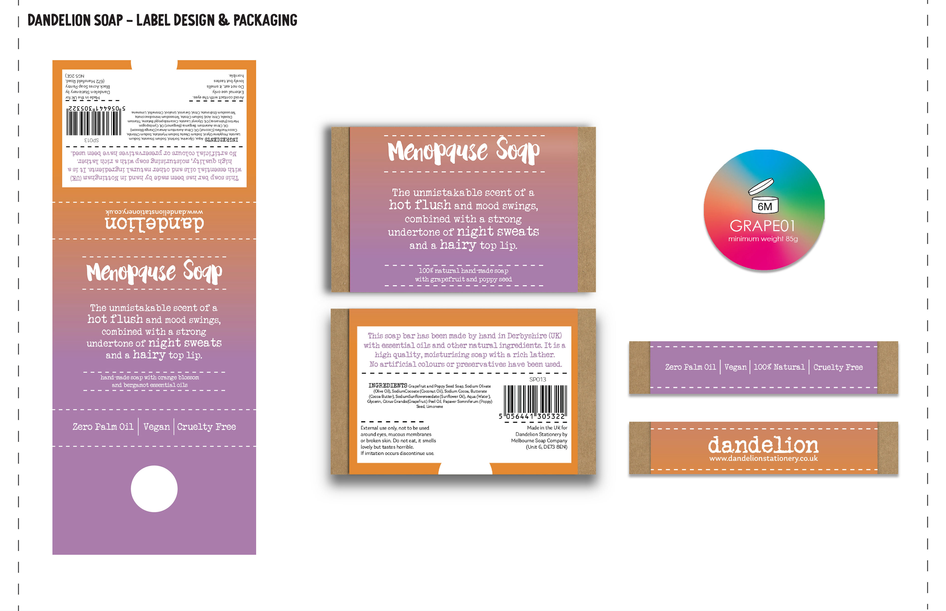
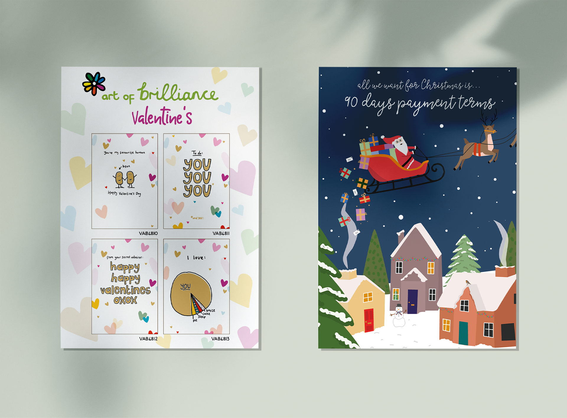
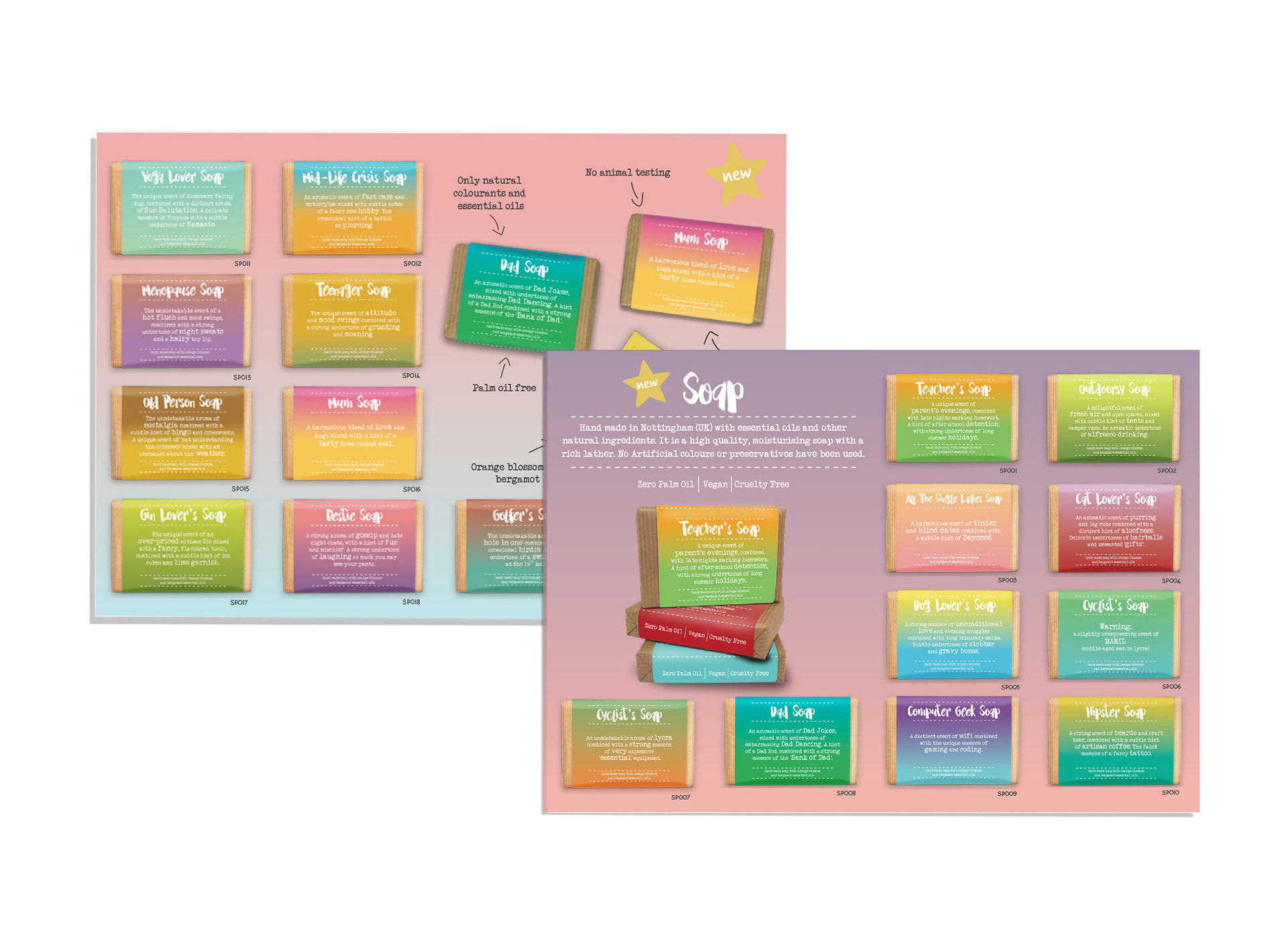
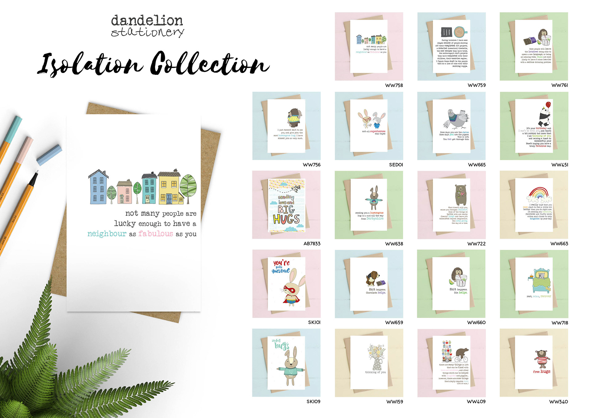
During my five years as an in-house designer at Dandelion Stationery, I played a key role in shaping the visual identity of the brand across both print and digital platforms. My work spanned from designing product collections to creating marketing materials such as flyers, brochures and packing slips. As well as retail-ready packaging, and digital assets for web and social media.
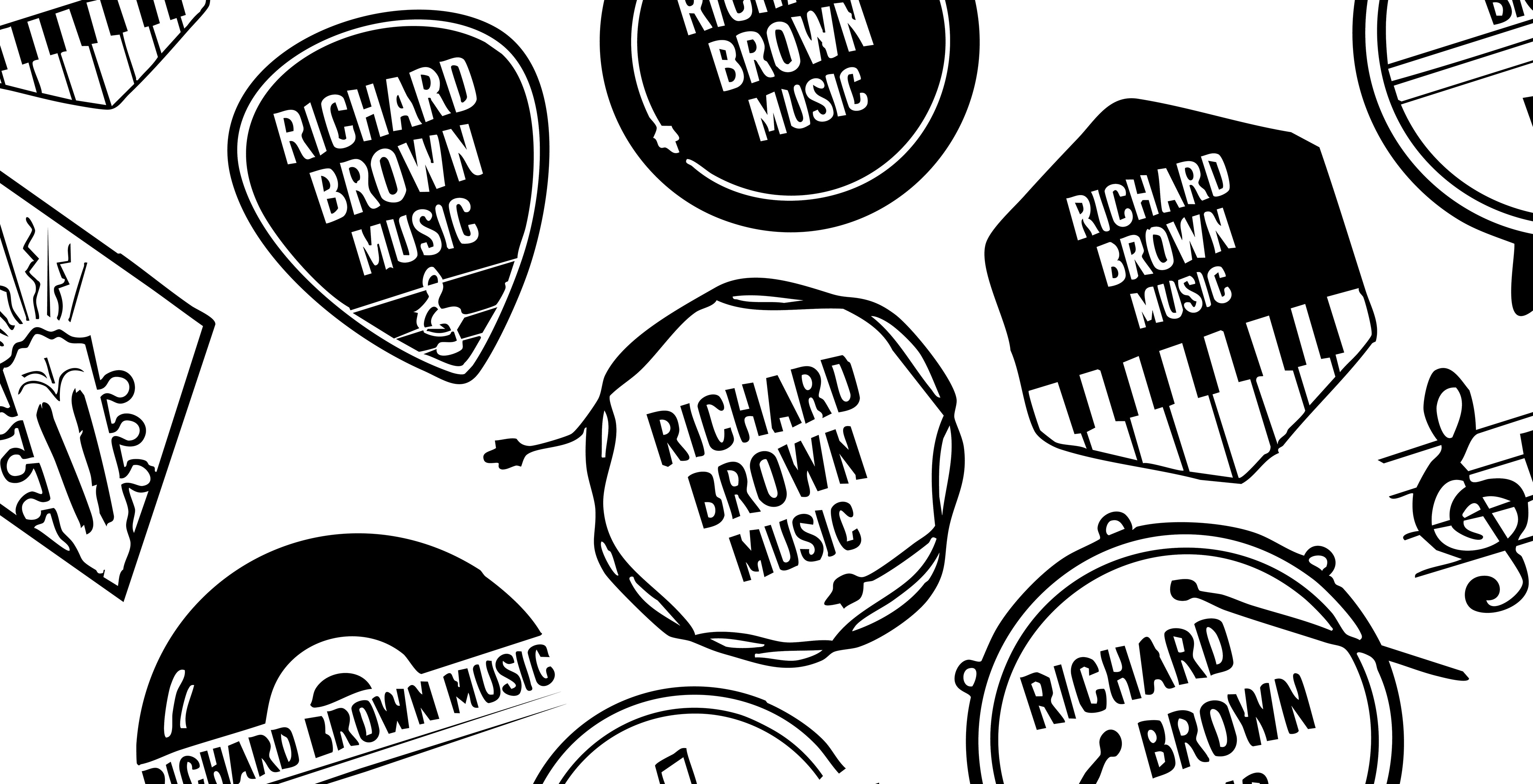
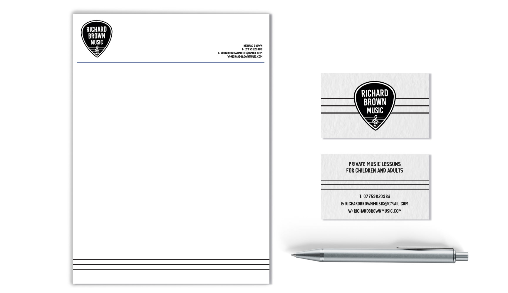
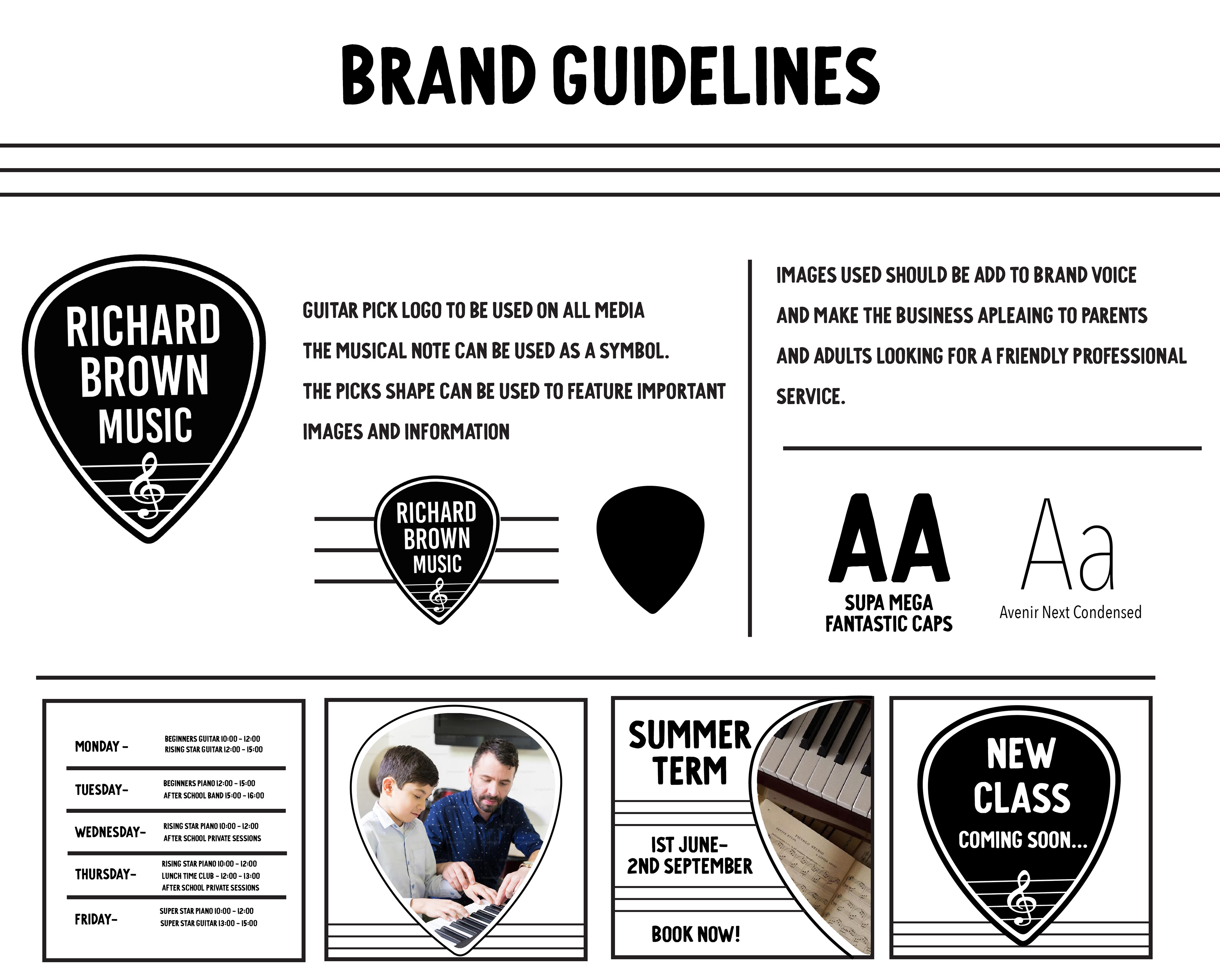
Richard Brown Music needed a cohesive brand identity that reflected his personality and style as a musician while working seamlessly across digital and physical channels. The goal was to create a professional yet approachable visual language that would engage his audience and support ongoing marketing. Through conversations and exploration of his musical style, we defined the essence of the brand as: expressive, professional, and approachable. These principles guided the creation of a flexible visual system.

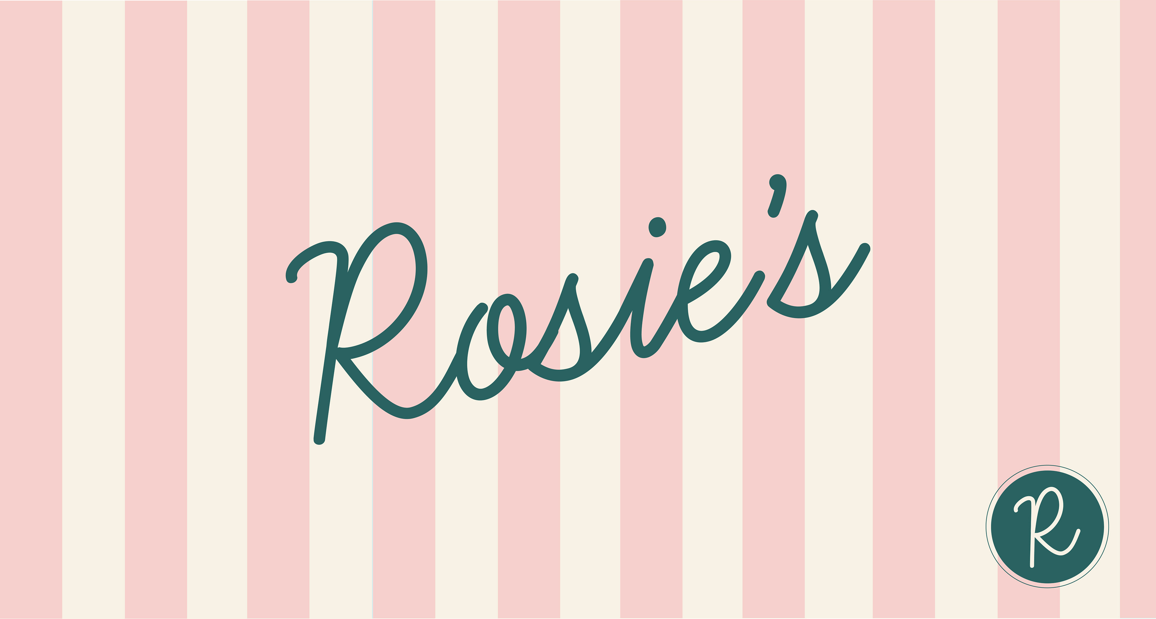
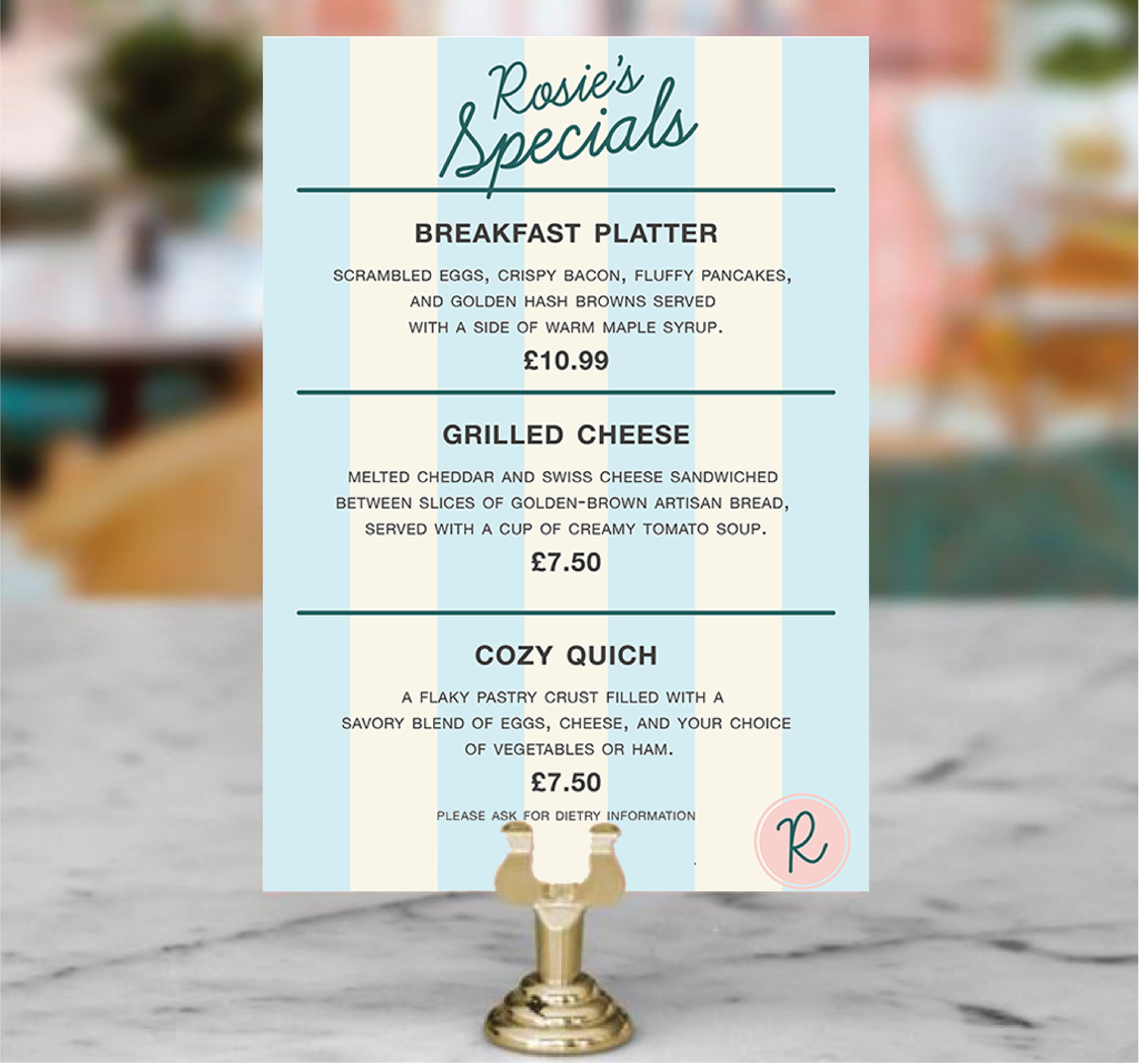
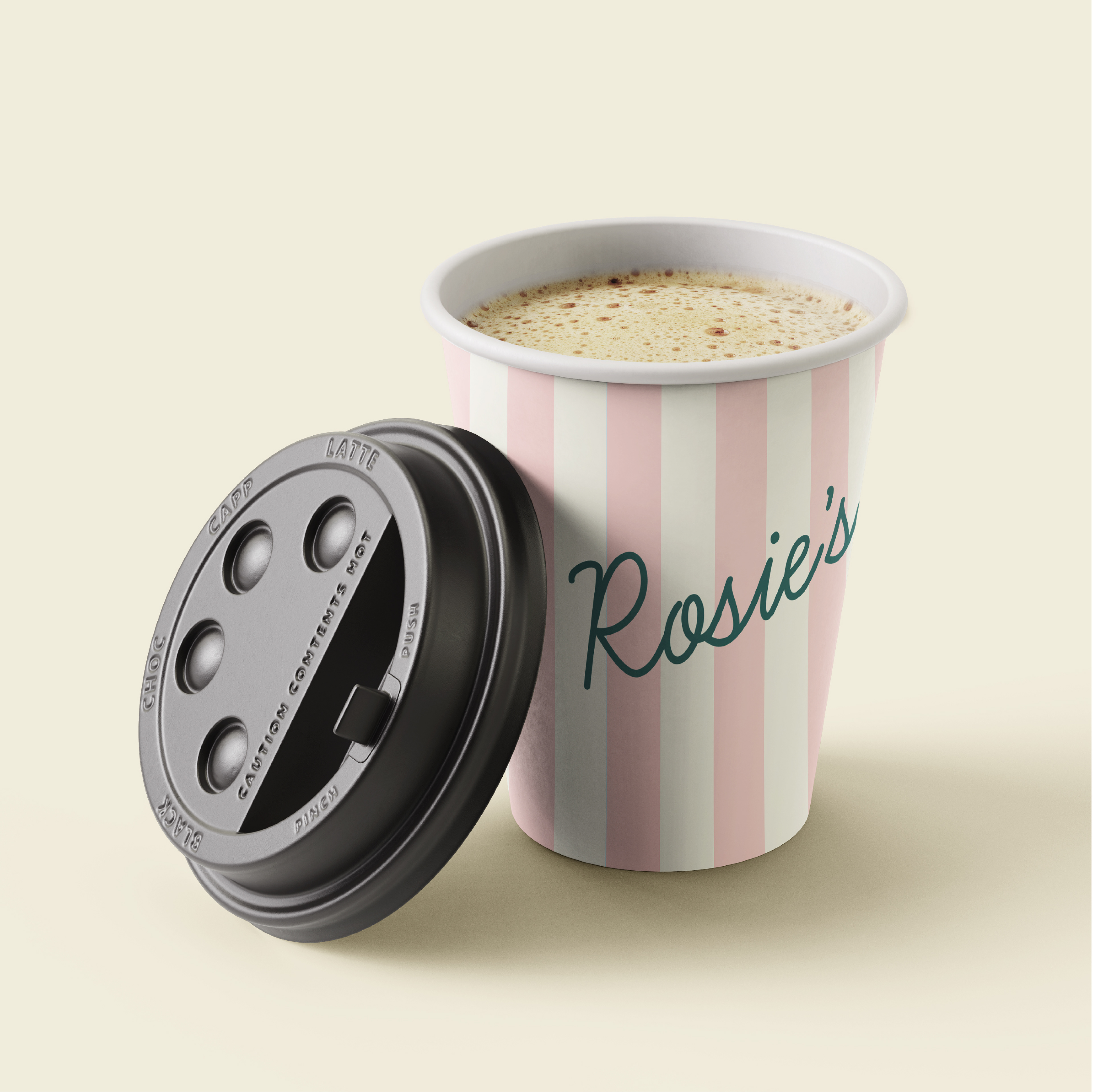
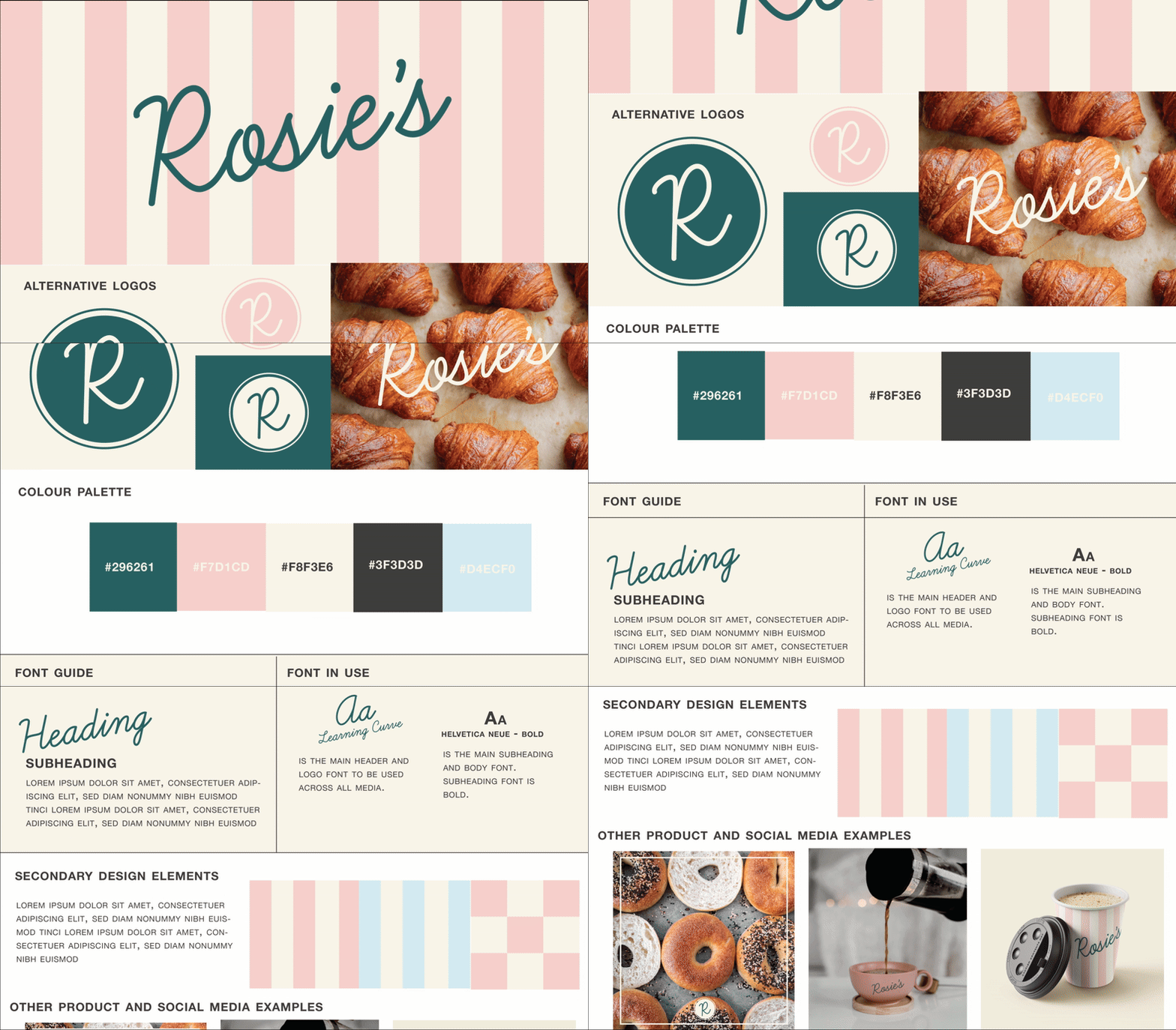
Rosies is a warm and friendly brand that required a visual identity to support its growth across digital and physical touch points. The brief was to create a brand that felt modern and approachable, while retaining a sense of heritage and trust.
With the new brand identity, Rosies aimed for improved brand recognition and stronger alignment between its visual presence and its core values. The cohesive brand system allowed for scalable growth, making it easier for Rosies to expand into new channels quickly.
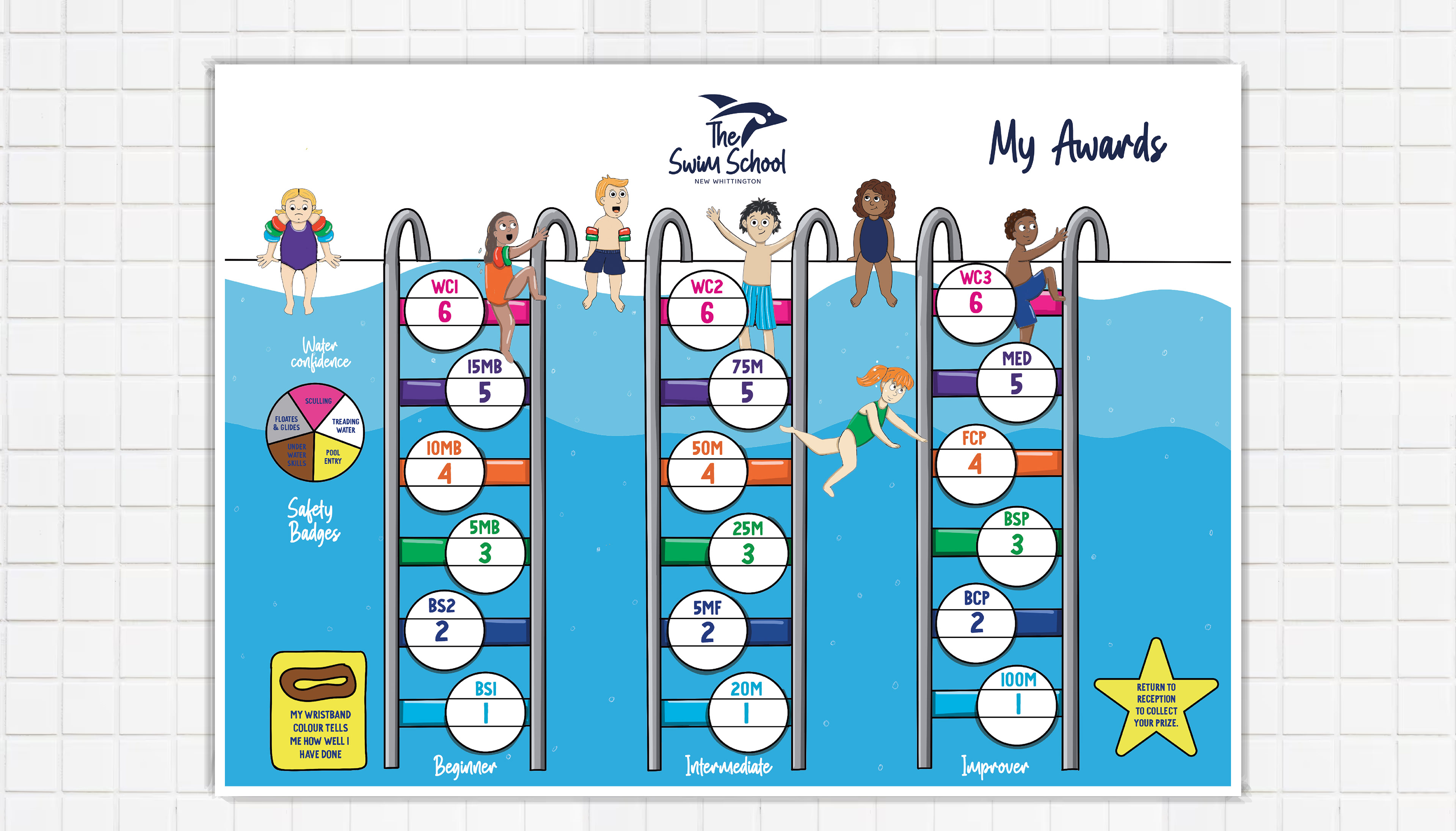
The Swim School approached me to refresh their existing logo while keeping true to the established brand identity. The goal was to modernise the logo for clarity, versatility, and consistent application across digital and print materials.